Pastels made their way from the kids’ room in the contemporary modern living room either as a design furniture or a wall paint already a while ago. But maybe only pink (in all variations) is the most polarizing among them, as even the statistics show:
“About 7% of women do not like it. But 12% of men say it is the only color they totally dislike.”
If you would ask people on the street about their ideas on pink, most of them would answer, it is feminine, soft, tender and more for girls.
But is that true? As a quick look into history shows, pink was not at all a feminine color, it was the exact opposite, namely a masculine one and blue was the girls color.
That changes in the 1920ties, when baby dresses turned from white into colored rompers due to the fact that creating colors without any harms was made possible and also to wash colored clothes on high temperatures.
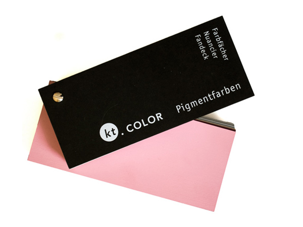
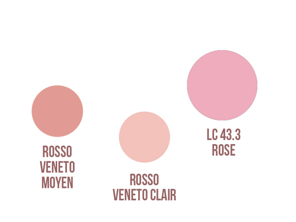
The famous architect Le Corbusier created in his first color palette in the 1930ties (called KT 32) earthy tones on deep red. In the 50s he shifted to more brighter and saturated colors (listed as KT 43) and among these you‘ll find a more brighter, saturated pink called „Rose“ numbered LC 43.3 and still available today through KT color in Switzerland.
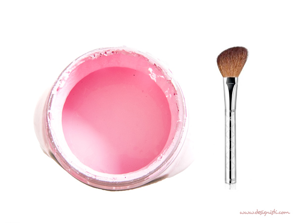
Le Corbusier Color LC 43.3 from kt.color, photo ©designisti.com
KT Color, © ktcolor.com
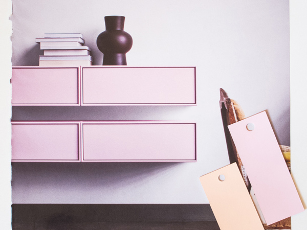
Montana shelving units, in Color: candy floss, as seen in catalogue 2012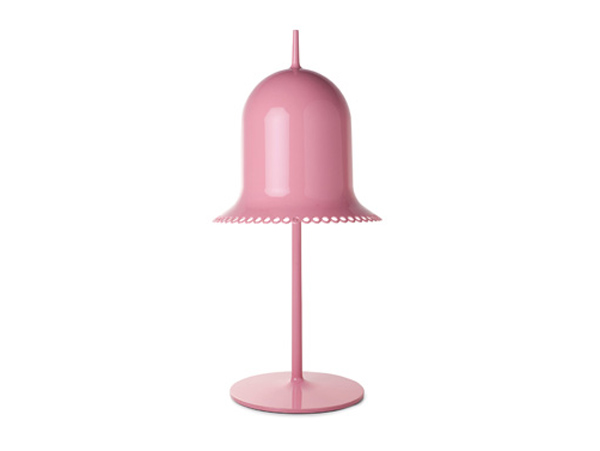 Nika Zupanc, Lamp Lolita, produced by Moooi
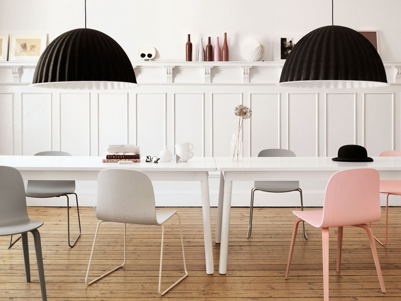
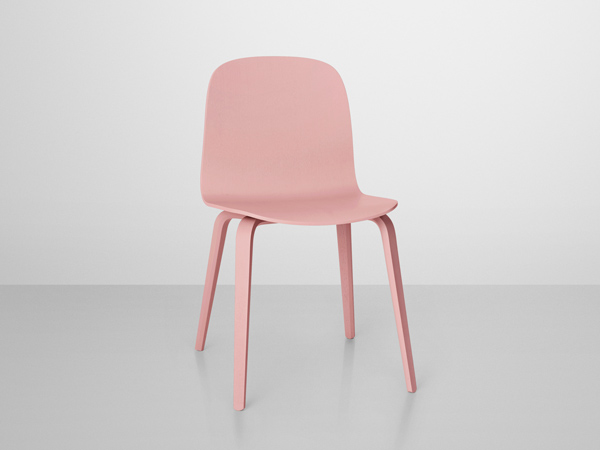 Visu Chair by Muuto
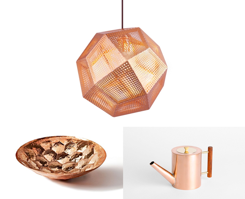 also quite trendy: hex copper dish and pendant light by tom dixon, tea pot japanmade
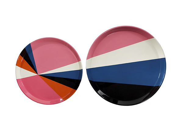
So after convincing your hubby that you ultimately need a color change in the house, how to combine it? To avoid a too romantic barbie-esque look do not mix it solely with too much white – combine it with other colors, that have a more „masculine“ spot (as India Mahdavi recommends…) from a navy blue over a simple warm grey to mate black or with earthy tones, the main thing is to balance it out. Also accessoires in Copper are a perfect match.


One Trackback
By Into the Green - by Vitra | www.designisti.com October 9, 2013 at 8:31 pm