
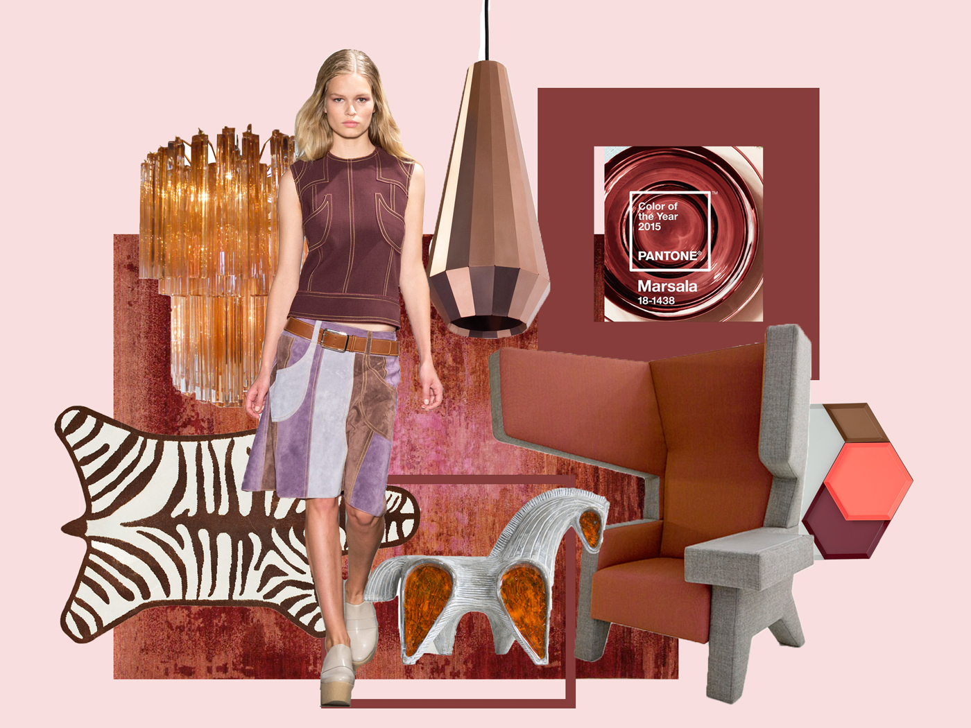
…tata – it is MARSALA….!
So, the first question which came to my mind was – what was the reason behind the choice for Marsala, to be correct – PANTONE® 18-1438 Marsala.
Pantone says, the color of the year reflects the culture of a specific moment, the Zeitgeist, looking for what people need, their expression, mood and attitude.
They comb the world looking for color influences in fashion and entertainment industries, the world of art, popular travel destinations, new textures, technology and even sports events that capture worldwide attention.
„While PANTONE 18-3224 Radiant Orchid, the captivating 2014 color of the year, encouraged creativity and innovation, Marsala enriches our mind, body and soul, exuding confidence and stability,” said Leatrice Eiseman, executive director of the Pantone Color Institute®.“
According to Pantone Marsala, rooted in the red-brown family, is rich and robust like earth, at the same time heartily, sophisticated, stylish, fulfilling and charismatic. It reflects stability, confidence, energy and strength.
Marsala was a hit on the Spring 2015 runways with fashion designers incorporating the hue into their collections and of course already captured the beauty sector as well.
Now, what about Interior, Design and Graphic Design?
Is it a stand-alone color?
Which shades are most appropriate to match with?
First of all, it is really a complex and full-bodied hue, extremely well on textured surfaces, making it an ideal choice for rugs and upholstered living room furniture as well as accessories.
However in my (humble) opinion for an appealing interior setting it needs to be enhanced by some sparkling buddies, e.g. shades that add a certain light, as pastels (as blush or blues) or even bright, bold colors (orange, yellow, pinks) or more elegant shades of grey.
Otherwise it would be too grounded for me (this applies also for its usage in Graphic-Design).
Also metallics like copper or gold are a good addition for Interiors. Regarding texture materials like leather, glass or ceramics are a perfect material mate.
So yes, I really think Pantone did again a very good job of scanning the Zeitgeist and Marsala seems to fit perfectly into the current global mood.
Very much looking forward how the color of 2015 will be further incorporated into the Interior and Design Szene.
And you, have you any opinions on how to use Marsala?
PS: thanks to Laurie Pressman from Pantone for the inspiring Trendwebinar…
credits to items shown above:
– zebra rug: Jonathan Adler
– carpet “fresco” by Haynes Robinson, via Gallery Nilufar
– Venini Chandelier, via 1stdibs
– Fashion Spring 2015 by Derek Lam, via style.com
– Copper Lightshade by David Derksen
– Glass Menagerie Horse by Jonathan Adler
– Ear Chair by PROOFF
– Tablet Kaleido by HAY
My first reaction on that colour was: uuuuh. Awful! I hate brown… etc. But – as always with these Pantone colours of the year, I changed my mind. Yes, this red-brown colour gives me peace and calmness. And after a very active with RED and than more spiritual period with Orchid, now we come down to Earth.
But, You are right. This colour needs a light partner, maybe pastels in blue or grey.
Thank you for this very good post!