After talking about the interior of an office space quite recently I would like to talk about a place we all have spent tons of hours. Some of these hours have been funny one’s, some exciting, some less interesting and some beyond boring. And often from a design point of view even less inspiring. So, let’s talk about an eye-catching interior design for a school!
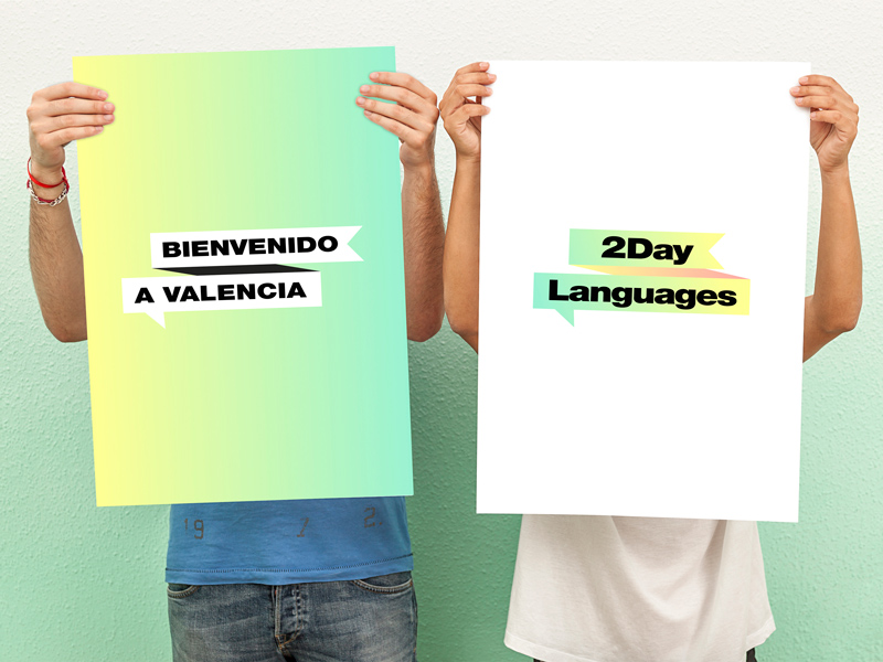
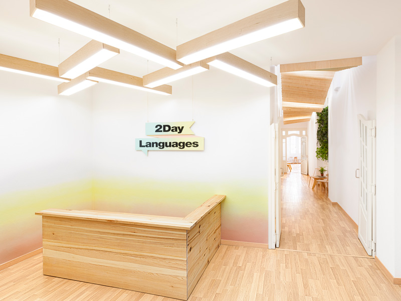
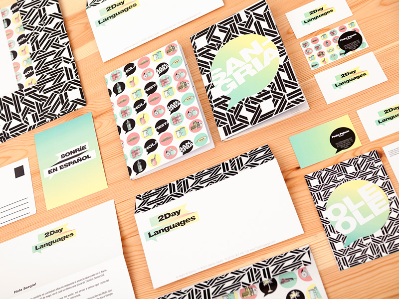
It is one of the latest projects of interior design and communication studio called Masquespacio based in Valencia, Spain. Their work for a new language school named 2day Languages is so fresh and welcoming in style that my immediate reaction was: oh yes, I would like to learn there!
Ana Milena Hernández Palacios, creative director of Masquespacio states:
As in the classrooms the students and their teachers are the protagonists, we wanted to limit our intervention to a minimum, without forgetting the freshness and “good feeling” that needed to breathe each space.
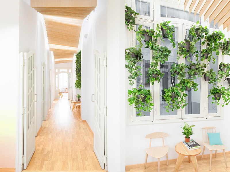
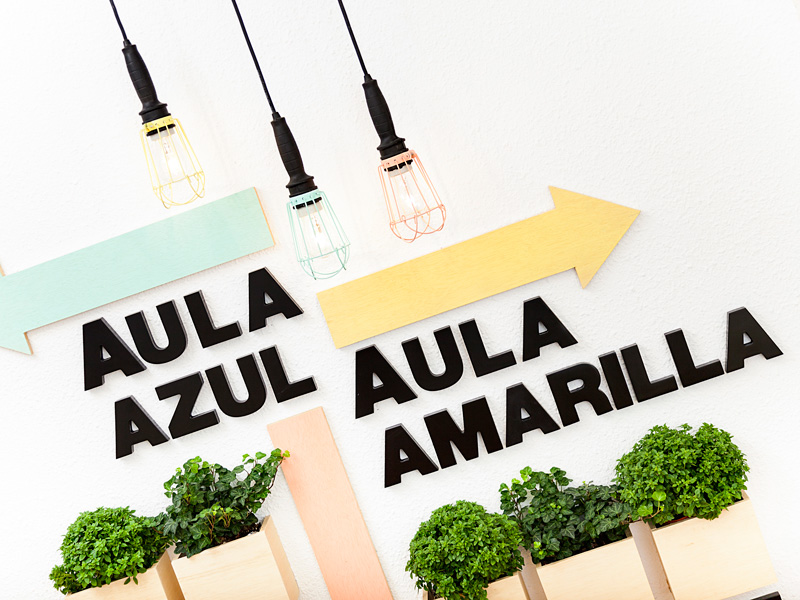
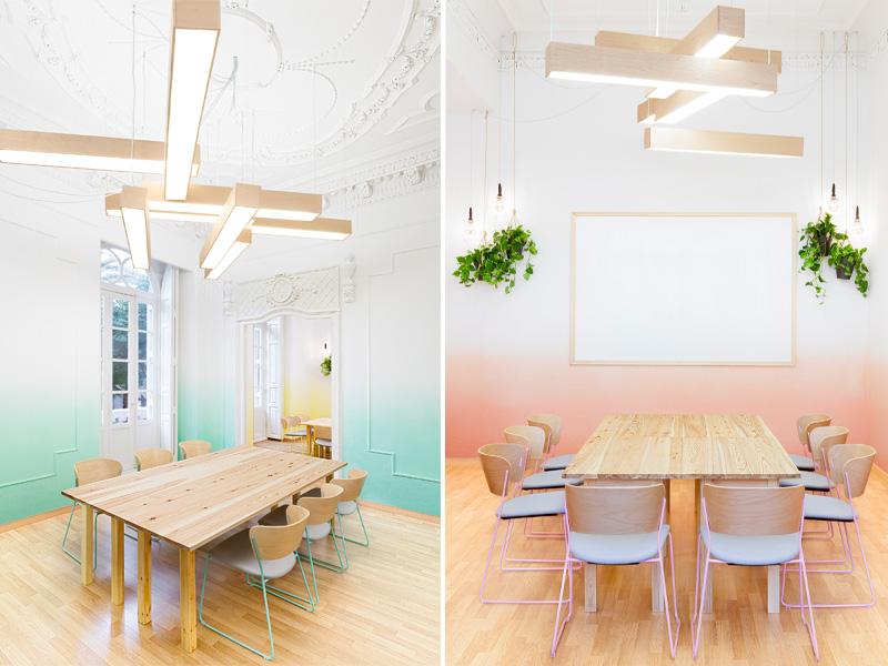
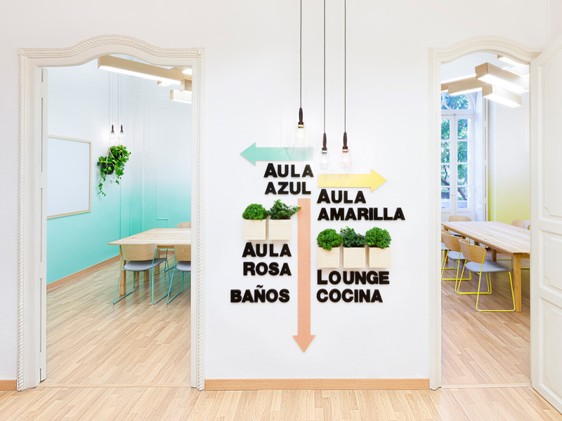
The space is developed on an area of 183 m2 that contains 3 classrooms, a staff room and a lounge. The classrooms contain the three brand colors, which in turn are a representation of the 3 different levels A,B and C seen as the colors blue, yellow and pink. But also the colors are representing the 3 characteristics in language learning: levels, goals, conversation. Every classroom contains a different color that is fading to pursue progress in language learning. The sculptural ceiling lamps are another reference to the school’s graphical elements.
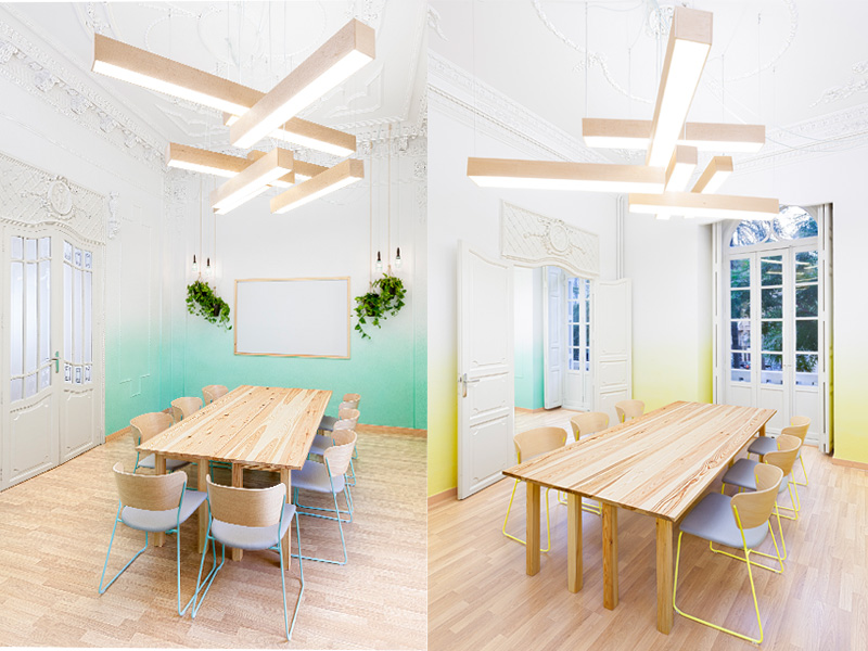
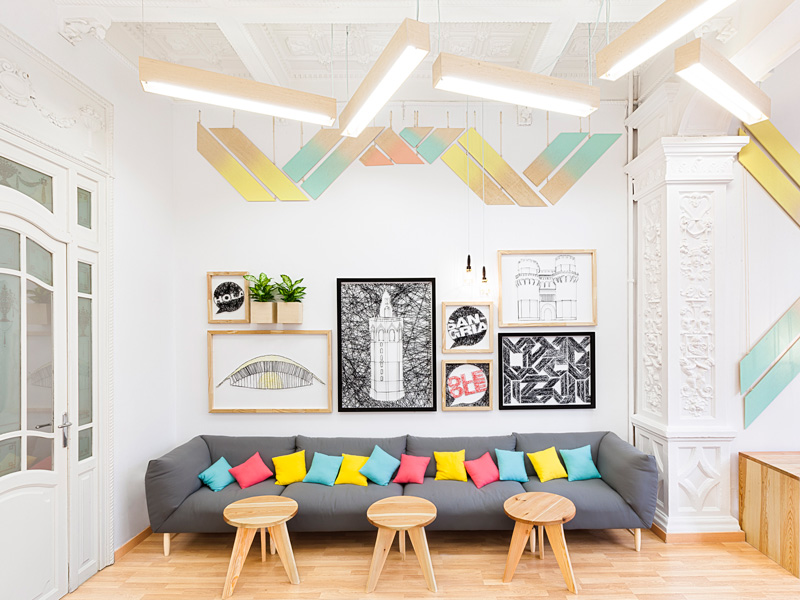
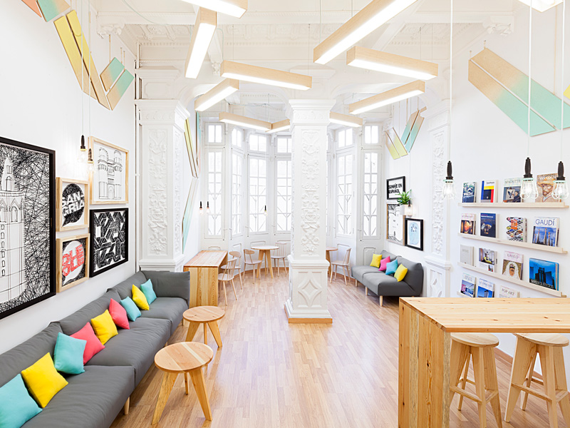

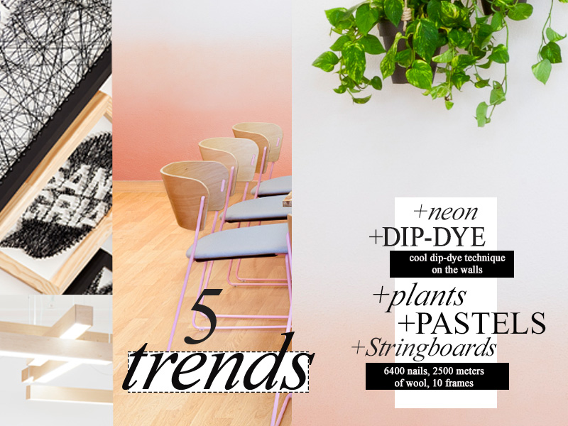 Warm materials like pine generate functional features. Chairs are chosen to offer maximum comfort. Looking closer we spotted five actual trends within the project. Plants, Pastells, Neon, Dip-Dye (colors fading at the walls) and Stringboards. All together the colors, the materials, the lightness, the decorative elements and the graphics infuse you with a fresh feeling and a happy learning experience is just around the corner.
Design: Masquespacio
Designer: Ana Milena Hernández Palacios
Photography: David Rodríguez from Cualiti